The foundation of a great digital experiences is laid with the Elements and Principles of visual design. They are crucial concepts to understand, whether you’re creating cutting-edge designs or critiquing one another’s work.
This is everything you need to know, all in one place.
The 7 Basic Elements of Visual Design
Elements are the basic building blocks of design. Informed designers use Elements to create and manipulate the broader Principles. In turn, the effective use of Principles is what ultimately shapes the user experience, influencing users’ perceptions and emotions. Put simply, if design Principles are the what, then design elements are the how.
Element of Design: Line
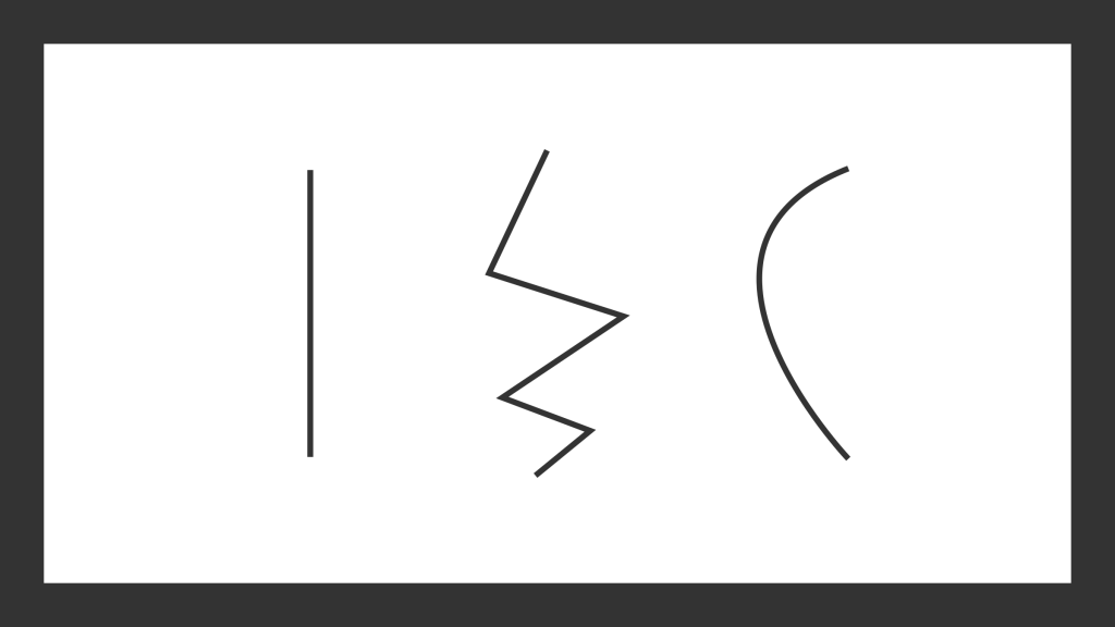
The Line Element is a mark whose length exceeds its thickness. Lines can be structural, a contour, or implied (see Gestalt). Lines can be straight, angled, curved, zigzagged, and everything in between. While curved lines elicit relaxed movement, diagonal lines invoke dynamic action.[1]
Element of Design: Space
The visual design element of space can be both two and three dimensional.[2] It is the plane where objects are placed. A lack of objects is white space, and together these qualities of space can influence all sorts of design principles.
Element of Design: Color
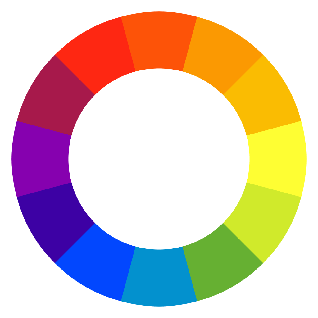
Color contributes to the mood of a design through color theory, and consists of hue, saturation, and value. It’s important to note that cultures around the world interpret color differently[3], and designers must educate themselves on these differences.
Element of Design: Shape
Shapes are Elements defined by a contour. Coming in two varieties, shapes can either be geometric, like the square above, or natural. Natural shapes are the organic forms found in, or representative of, nature. Shapes can create a personality and feel within a design, and attract or point attention.
Element of Design: Form (or Mass)
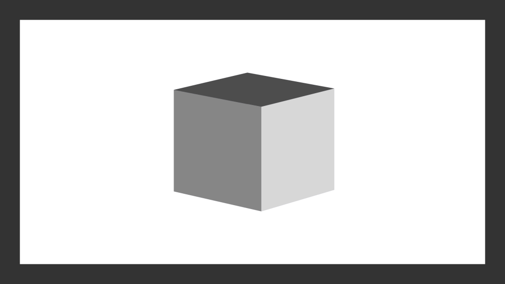
The Form Element is a measure of something’s height, width, depth and mass. A form is made of shapes, and can be combined with other elements like color and texture. Forms can be created by a designer, but they aren’t always in the designer’s control. For instance, a user’s computer or browser isn’t something a web designer can control. But the product designer who made the computer can. Form is the root of the term form factor.
Element of Design: Texture
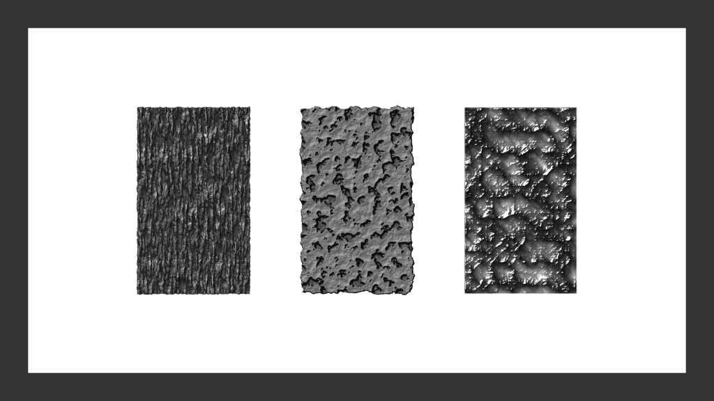
Texture is the quality of an object’s surface.[4] It imbues a sense of touch and feel. Some textures are only visual and give a sense of suggested texture, while others are truly physical and tactile. The Element of Texture can play into the Principle of Rhythm to create interesting patterns, and can be used give a design depth and cohesion.
Element of Design: Motion
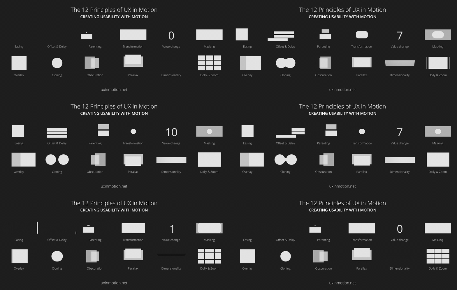
Unlike the principle of movement, which can use implied motion, the element of motion in design is literal. These days, this is seen in digital and time-based mediums. Motion supports design principles like emphasis, rhythm and direction.
The Basic Principles of Visual Design
Principle of Design: Balance
Balance is the distribution of design elements across space.[4] Just like a boat with loads of weight on one side will capsize, design requires balance. Balance can be symmetrical and asymmetrical, or can be broken to create emphasis.
Principle of Design: Unity (or Harmony)
Too many disparate design elements create dissonance. And creating unintentional dissonance should be avoided. Designers can create a sense of unity by controlling the variety of design treatments.[5]
Principle of Design: Emphasis (or Dominance)
Emphasis tells the user or viewer what is important and what to look at first. Using the elements of design, designers can suggest a hierarchy of elements, set user/viewer expectations, and create balance and unity.
Principle of Design: Scale (or Proportion)
Scale plays with the relative size of elements, and has an central role in defining hierarchy and importance.
Principle of Design: Rhythm
Rhythm encompasses pattern and repetition. As a group, they provide predictability and harmony. While repetition is its simplest form, patterns and rhythms are more complex sets of intersecting repetitions.


A rhythm is the most complex and abstracted model. Abstract though it is, rhythm is quite identifiable in music.[6]

Principle of Design: Movement (and Direction)
Direction and movement create visual displacement, or the illusion of it.[2] These can be used to create emphasis, purposeful tension, and other useful design devices.
Other Design Elements and Principles You’ll Hear
Gestalt
Gestalt principles consist of similarity, continuation, closure, proximity, figure & ground, and symmetry & order. We recommend reading the great article defining Gestalt Principles over at Toptal.
Typeface
Included in some lists of design elements, Type has been intentionally left off this one. Yes, typography is a fundamental part of visual communication. But it’s also effectively made up of other existing design elements — lines, shapes, and so on.
Economy
Economy is relevant in real world situations where clients, or a limited set resources, are involved. When the “product or service is more important than the elaboration of design elements” it places limitations on the designer.[2] Often times, constraints like these are what lead to truly remarkable design.
“Design is all about finding solutions within constraints. If there were no constraints, it’s not design – it’s art.”
Matias Duarte, VP of Material Design at Google, YouTube [6:49]
Contrast (and Similarity)
Contrast can be achieved through the differentiation of any design element or principle. Black against white; angular against round; small against large — these all create contrast. With contrast, designers can create focus, balance, and harmony.[5]
Design Element of Size
See: Principles of Design: Scale (or Proportion), above.
How are the Elements and Principles of Design Applied in Real Life?
Bannersnack: Elements and Principles of Design To Use For Inspiration
^ really good link
Toptal: The Principles of Design and Their Importance
Art Class Curator: Principles of Design Examples
References and Further Reading
- Tomita, Kei. “Principles and elements of visual design: A review of the literature on visual design of instructional materials.” Research Gate. Educational Studies, IERS, International Christian University, 2015.
- Hu, Meidor. “Elements of Design.” Art 101. University of Hawaii. Accessed 28 April 2020.
- Ware, Colin. Visual Thinking for Design, Morgan Kaufmann, 2008.
- Lohr, Linda L. Creating Graphics for Learning and Performance: Lessons in Visual Literacy (2nd Edition), Pearson, 2008.
- Gatto, Joseph A., et al. Exploring Visual Design: The Elements and Principles (4th Edition), Davis Publications, 2011.
- Lamp, Lucy. “Design in Art: Repetition, Pattern, and Rhythm.” Sophia Learning. Sofia Learning, LLC. Accessed 2 April 2020.
Cover photo by Vugar Rahimov
