Color Theory, Visual Design & Sir Isaac Newton
‘Color’ is one of the 7 Elements of Visual Design. And you could spend hours going deep into color theory. But we’ve only got two minutes, so let’s get to it.
Color theory itself focuses on the aesthetic and psychological effects on visual design. Believe it or not, the origins of our modern color wheel are rooted in Sir Isaac Newton’s 1665 Color Theory.
Why Color Theory Matters
Newton’s original Color Theory contained seven named colors. Interestingly (and intentionally), this is the same as the number of notes in a musical scale.
Using aspects of color like temperature, makeup and relative location on the color wheel, designers can use color to directly influence their users’ emotions.
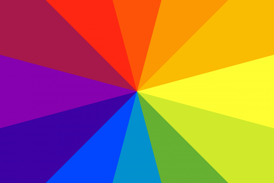
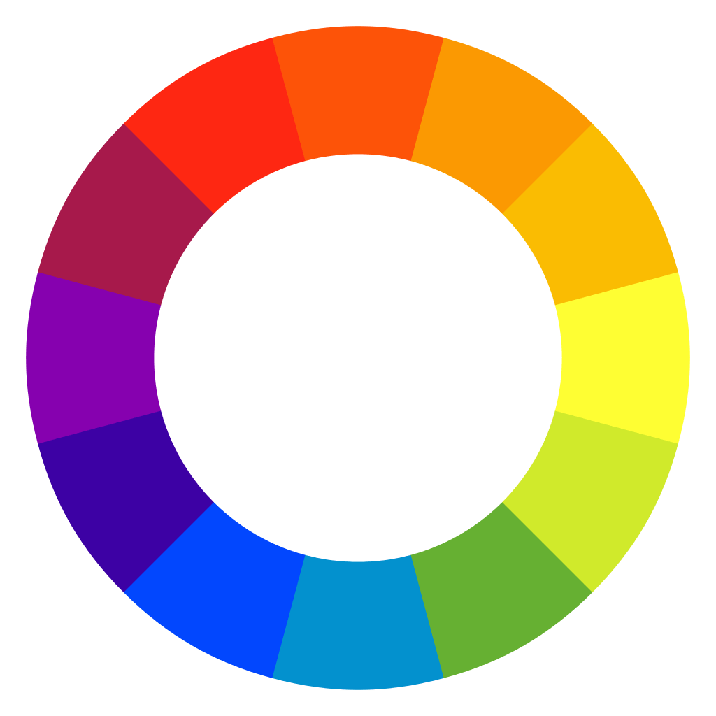
Color Wheel Basics
Temperature
Colors can be split into two groups by temperature. Warm colors are ones like red and yellow, and cool colors are those like blue and green. It’s worth noting that neutral colors like grey, white and black are sometimes included as a third neutral temperature category.
Color Makeup (Primary, Secondary, Tertiary)
Next up, the makeup of colors can be either primary, secondary, or tertiary (also called intermediate):
- Primary: red, blue, and yellow.
- Secondary: any combination of two different primary colors.
- Tertiary (Intermediate): any combination of one secondary color and one primary color.
Color Schemes & Relative Location on The Color Wheel
There are five basic color schemes that these colors fit into. These color schemes use each colors’ relative location to create aesthetically-pleasing combinations:
- Analogous: Successive colors on the color wheel.
- Complementary: Colors on exact opposite sides of the color wheels. These colors have a high contrast from one another.
- Split-Complimentary: Analogous colors paired with their complimentary counterparts.
- Triadic: Three colors, equidistant from one another on a color wheel.
- Tetradic: Four colors, equidistant from one another on a color wheel. Note that this effectively creates two sets of complimentary colors.
Color Theory ➡️ Visual Appeal & Emotion
Colors are powerful tools to designers because of the emotions that our users tie to them.
It’s too easy to generalize our emotional associations with color. More often, our associations vary by culture, geographic location, and personal experience. As with any design, always ensure you’re designing for your users. Be wary of over-generalizing, and do your research.
This is just a quick explanation of color, color theory, and the roles they play in web design. Make sure to check the other Elements and Principles of Design, along with the implications of color in different cultures. Some might surprise you.
Color is one of the 7 Elements of Visual Design, and part of the longer list of Elements and Principles of Visual Design. When it comes to UX, UI and web design, these are all essential to have in your skillset.
References
- “Color Theory.” Interaction Design Foundation. Accessed 1 June 2020.
- Taylor, Ashley P. “Newton’s Color Theory, ca. 1665.” The Scientist. LabX Media Group, 2017.
- Tomita, Kei. “Principles and elements of visual design: A review of the literature on visual design of instructional materials.” Research Gate. Educational Studies, IERS, International Christian University, 2015.
Cover photo: Wikimedia Commons
Good info here! I sometimes use my color wheel to help choose fabrics for my quilting projects.
Quilting sounds like a great application of color theory! What’s your favorite color combination that you’ve ever made?