
The Design Element of Space
Space, simply put, is the plane upon which the objects in your design lay. And, it’s one of 7 Elements of Visual Design. Space can be two dimensional, but can also be three dimensional when in the physical world or a simulated 3D space.
When you have a lack of objects on your plane, this creates white space. And white space is very important when designing for the web.
Why White Space Matters
White space is the catalyst for directing the user’s eye and implying connections — basically it allows you to utilize all the Principles of Gestalt.
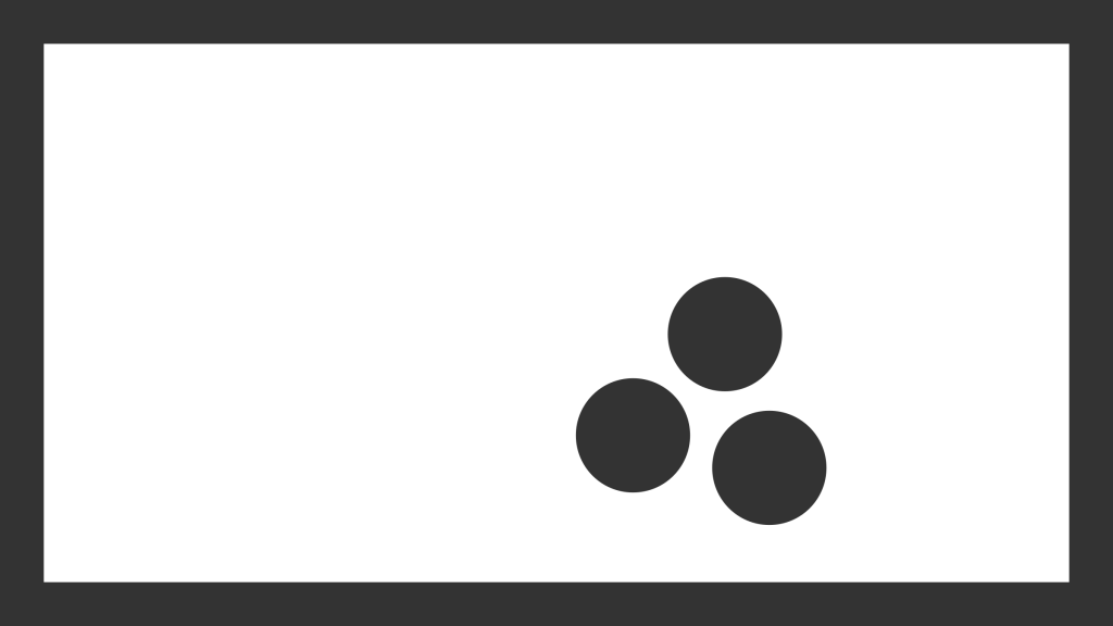
A Quick Primer on the Gestalt Principles
- Proximity. We tend to group and associate objects together if they are near each other. For sighted users, an input label and the input field itself are often associated via proximity.
- Similarity. We also tend to group objects when they appear similar. Similarities can be in lightness, color, size, orientation, shape, etc.
- Continuity. When objects are aligned, we perceive them as a whole. Just look at the letter ‘X’. You don’t see four separate lines converging, you see two overlapping. The same goes for rows and columns in your layouts. This is continuity.
- Closure. Similarly, we tend to group objects when they form a closed figure. Stonehenge, when seen from above, looks like a circle. So does a circular loading animation consisting of multiple objects. But the loading animation also employs Common Fate.
- Common Fate. Objects moving together tend to be perceived as a group. A flock of birds flying in one direction is a good analogy. So are groups of objects that animate into view on scroll.
White Space is Pleasing to the Eye
White space can also be desirable by itself. In the physical world, space and light are pleasing to the human eye. In this regard, visual web design is no different.
Allowing well-placed Space in your designs can significantly reduce the chances of cognitive overload in your users.
Giving users small visual breaks can dramatically change the feel of an interface. A messy house feels worse than a clean one, right?
Element of Space ➡️ Room for Your Designs to Breath
It’s that simple. Space, and white space by extension, give you the ability to suggest, draw focus, and establish an aesthetic. Space is pleasing, it reduces the cognitive stresses placed on your users, and allows them to soak in information.
You should walk away with a better idea of what the Element of Space is, and how to better use white space in your web designs.
Space is just one of the 7 Elements of Visual Design, and part of the longer list of Elements and Principles of Visual Design. When it comes to UX, UI and web design, these are all essential to have in your skillset.
References
- Todorovic, Dejan.”Gestalt Principles.” (2008). Scholarpedia. Brain Corporation. Accessed 28 May 2020.
- “Gestalt Principles.” Interaction Design Foundation. Accessed 28 May 2020.
Cover photo: Jakub Kapusnak
Pingback: Emerging Trends For Hotel Website Design In 2022