Why Isn’t there More Motion in the Ocean?
Motion tells a story[1], and Designers are nothing if not storytellers. So why is Motion still so overlooked in UX and UI Design?
I personally blame the static origins of Graphic Design and the early days of the web. Owing to this legacy, Motion Design is a skillset that generalists often skip in favor of awesome flows or general aesthetic sensibilities.
Unfortunately, this creates second–rate user experiences that either use Motion incorrectly or miss out on its benefits altogether.
Realizing this oversight too late, many teams hire dedicated Motion Designers to fill the gaps they’ve created (unless the company is so huge that it can afford super granular design roles).
So, in the interest of being well-rounded designers, let’s fix that. Arm yourself with these basics and bring a unique skillset to your next design or interview.
What is the ‘Motion’ Element of Design?
Motion is one of the 7 Elements of Visual Design. In short, it helps users understand what an interface is doing, and what it can do, and it does this through the literal movement of Shapes within a field of design.
Motion is one of the more interesting Elements of Design because it goes beyond two or three dimensional Space and incorporates the dimension of time. But too many UX and UI teams still under-utilize it.[2]

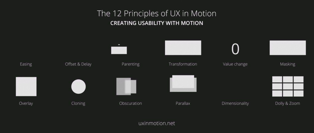
The 12 examples of Motion UI Design above are a great starting point. However, the number of ways in which various forms of Motion can be combined and modified means the possibilities are nearly endless.
These endless possibilities make it easy for designers to overuse Motion. Conversely, it can also overwhelm us into ignoring it. But there’s a sweet spot in the middle that will help you create easy–to–understand experiences that are genuinely fun.
Why Motion Matters
At its core, I consider UX Design to be the pursuit of symbiosis between a user’s mental model and the interface’s conceptual model. Having your expectations met, and then exceeded is what makes for a wonderful user experience.
Enter: Motion.
Using The Element of Motion in UX & UI Design
With all these expectations, designers need to effectively communicate stories. And the ‘stories’ you tell can be big (like an onboarding experience), or small (like where that minimized window just went).
Motion is here to help on both fronts, as a supporting element, to ensure your interface meets and exceeds the expectations of your users.
Imagine this example use case.
In most digital progressions, like an onboarding experience, a visual ‘steps’ tracker tells users where they are in the process. To drive the point home, many also use subtle motion to transition between steps by moving on-screen elements from right–to–left.
By moving elements from right–to–left on the screen, the user effectively moves in the opposite direction, relative to the on–screen elements. For users whose languages read left–to–right, repeating this movement gives a sense of progression.
You might be thinking, “Okay I get when to use Motion, but how should I actually animate it?”
Glad you asked.
Quick & Dirty: Motion Best Practices
- In most cases, a swing animations (aka easing) work best when dealing with UI elements.[4]
- Animation speeds should typically be under 500ms (half a second). I use 200-300ms a lot.
- Be wary of moving too many UI elements at once or unnecessarily.
- When it’s unavoidable, like animating complex groups, choreograph your transitions to avoid overlapping transformations that compete for your user’s attention.[4]
- Be wary of animating UI elements too fast (disorienting for users) or slow (makes your product feel sluggish).
- If an animation feels too fast or too slow, adjust it in 25ms increments.[5]
(Judicious) Use of Motion ➡️ Storytelling & Context
Is a design fun or playful? Is a component persistent even though it’s collapsed or hidden? The Design Element of Motion can help sighted users navigate and understand these concepts through subtle cues of movement.[3]
When used correctly, the Motion Design in a UI can dramatically improve your end user’s experience. So the next time you’re faced with a design problem, don’t limit yourself to two or three dimensions. Utilize Motion. Leverage the dimension of time.
This should give you a broad idea of how Motion should be utilized in UX & UI Design. If you’re interested in learning more, use the links listed throughout the article and check out the references listed below!
Motion is one of the 7 Elements of Visual Design, and part of the complete list of Elements and Principles of Visual Design. When it comes to UX, UI and web design, these are essential tools to have in your skillset.
References
- Dehner, Craig. “Motion Design is the Future of UI.” Prototypr. Medium. 2016.
- Knight, Westley. “Using Animation.” UX for Developers How to Integrate User-Centered Design Principles Into Your Day-to-Day Development Work. APRESS, 2019. 121.
- Morgan, Herman. “Motion Design and Its Impact on User Experience.” UXmatters. 2018.
- “Understanding motion.” Material Design. Google LLC. Accessed July 6, 2020.
- Naimark, Jonas, “Motion Design Doesn’t Have to be Hard.” Google Design. Medium. 2018.
Cover photo: Vidsplay