Shapes, Feel and Personality
‘Shape’ is an often overlooked member of the 7 Elements of Visual Design. It’s so fundamental that it almost feels… basic. Usually, thinking of ‘shapes’ conjures images of minimalist modern paintings or children’s toys, instead of thoughtful design strategy.
But there’s a good reason these mediums make such heavy use of the Shape design element: they have a singular ability to embody a personality — a feel.

When it comes to the elements of design, shape doesn’t seem to generate the same general interest that Color and Color Theory do. Which is too bad, because Shape can be a designer’s tireless ally in everything from web design to UX.
Why Shapes Matter
Shapes have existed ever since early humans started painting them on cave walls. Our brains love to make associations, so shapes often serve as simplified stand-ins for more complex objects or abstract concepts.
For example, a square typically implies enclosures — think towns, rooms, and security.
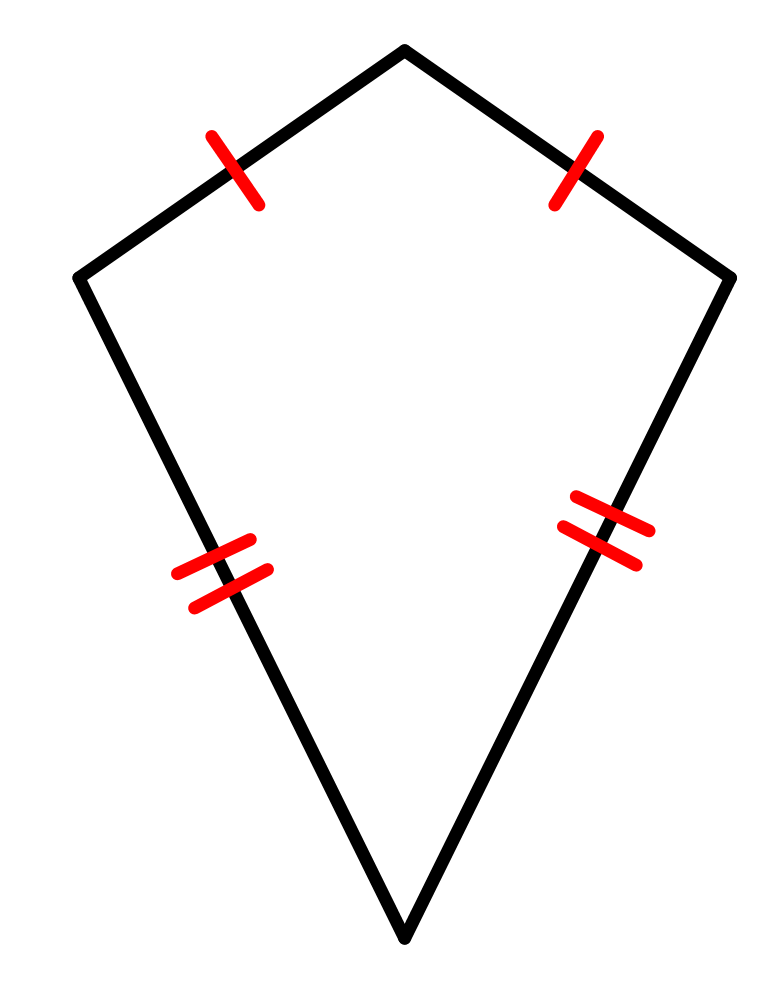
On the other hand, a diamond (or kite) shape looks impressive, it looks empowered. You may feel like it’s rising, or it might bring to mind a human torso with broad shoulders. Or maybe it just makes you think of an actual dug-it-out-of-the-earth diamond. Bling bling.

No matter the shapes you choose, when it comes to designing interfaces and experiences online, shape elements can play a major role in your product’s look and feel.
Using Shape Elements in Web Design
Web design, in a basic sense, is more or less a collection of reusable boxes. It’s just boxes within boxes — boxes all the way down — that we re-use in our atomic component structures.
These boxes, or rectangles, contain all of the content and interactivity. But, how it’s all contained makes a huge difference. Let’s put Shape to the test in a few plausible web design use cases:
- Your product and brand is trustworthy, sturdy, no-nonsense. Maybe it’s a financial product aimed at huge enterprises or old-school investors… Your boxes are probably just rectangles — straight lines, sharp corners, no frills.
- Your product is trustworthy and secure, but it’s also friendly and helpful. Maybe your product is a healthcare service dealing with insurance or affordable access to medications… Now, your rectangles are just rounded off a bit at the corners.
- Your product is a breath of fresh air. It’s a friendly, consumer-facing brand, but it’s also a total disruptor to the old guard. You’re targeting forward-thinking consumers hungry for something truly new and out-of-the-box… This time, you eschew geometric edges altogether and separate your sections into organic shapes. Some sections are broken completely by placing elements outside or partially outside their confined not-a-box boxes.
The possibilities and combinations are nearly endless. So let’s end them. You get the idea.
In short, these simple examples illustrate how designers use Shape to craft different senses of personality and feel inside digital interfaces.
Shape ➡️ an Element of Design with Personality
Shapes are powerful because they embody an identity. We associate shapes with things and feelings we recognize — like a stop sign octagon in the United states — or abstract waves contained by flowing line elements. In short, shapes give a design personality.
But this is only the beginning when it comes to Shape and the roles it plays in web design. If you’re interested in learning more, follow the links called out in the article above and take a look at the references listed below.
Let me know when you think in the comments. Bonus points if you caught the Hitchhiker’s Guide to the Galaxy reference.
Shape is one of the 7 Elements of Visual Design, and part of the longer list of Elements and Principles of Visual Design. When it comes to UX, UI and web design, these are all essential to have in your skillset.
References
- Meier, Allison. “An Eccentric Visual History of Our Most Basic Shapes.” Hyperallergic. Hyperallergic Media Inc., February 5, 2016
- “Visual design elements and principles.” Wikipedia. Wikimedia Foundation, Inc. Accessed 10 June 2020.
- Tomita, Kei. “Principles and elements of visual design: A review of the literature on visual design of instructional materials.” Research Gate. Educational Studies, IERS, International Christian University, 2015.
Cover photo: Birch Landing Home